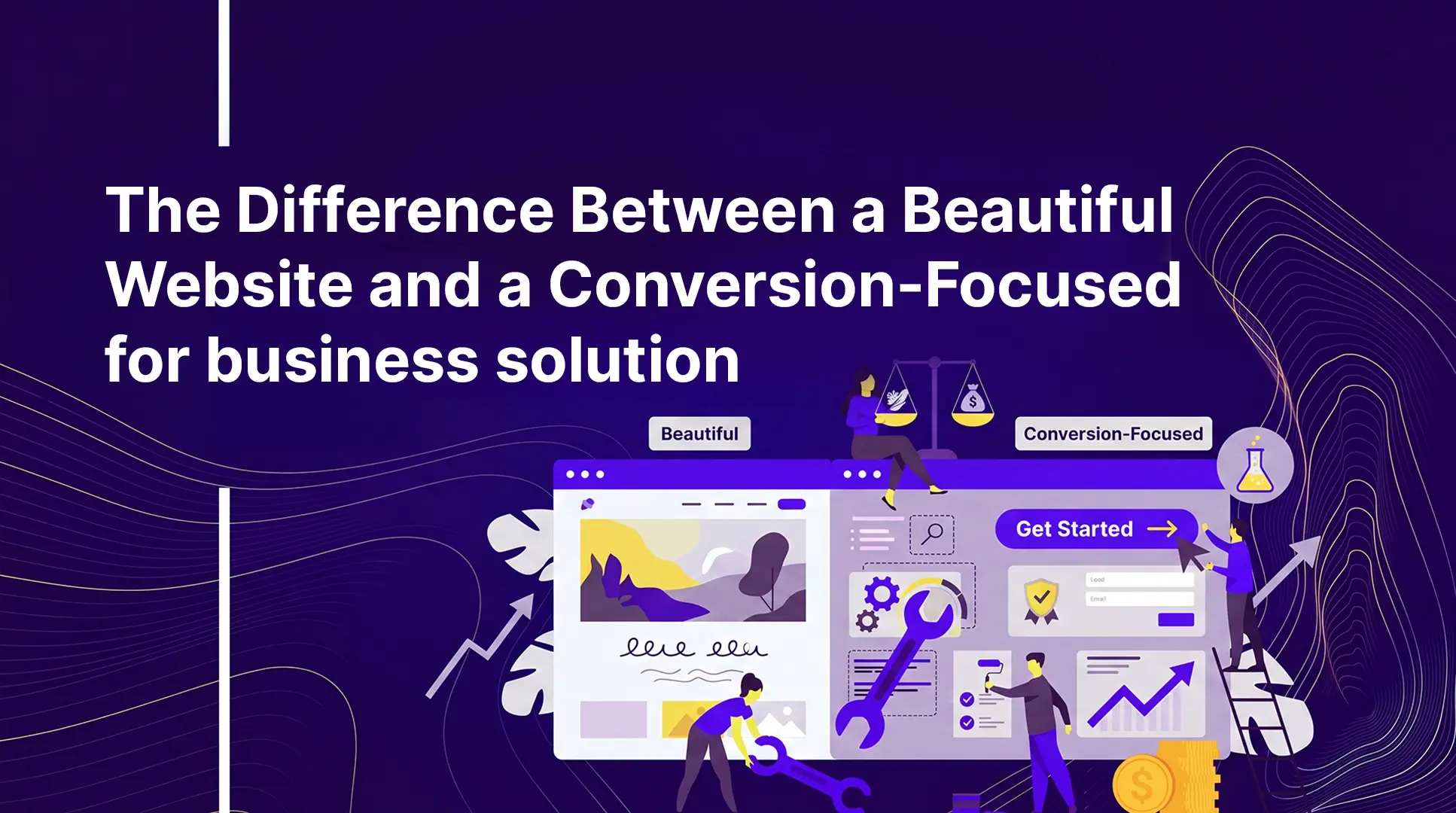
The Difference Between a Beautiful Website and a Conversion-Focused Website
Most founders confuse good design with good UX. Here's what a conversion-focused website actually looks like and how to build one.
The Difference Between a Beautiful Website and a Conversion-Focused Website
Your Website Might Look Exactly the Way You Wanted It To. But Is It Helping Buyers Decide?
Your website might look polished. It might feel premium. People might even compliment it.
But if it isn't helping the right buyers move toward a decision, the design may actually be working against you.
This is one of the most common and expensive mistakes businesses make when redesigning their websites. Somewhere along the way, many companies start treating design quality and business performance as the same thing. They're not.
A beautiful website can create a strong first impression. A conversion-focused website helps buyers understand, trust, and take action.
The best websites do both.
Your Website Looks Great. So Why Aren't the Leads Coming In?
A founder at a B2B company spends months and a significant budget on a website redesign. There's new branding, smooth animations, and a hero section that looks worthy of an agency awards gallery.
The website launches.
Friends, clients, and colleagues say it looks brilliant.
Yet the enquiries don't increase. The right buyers still aren't reaching out, and nobody can quite explain why.
This happens more often than most businesses realise, and it usually comes down to a single misconception:
A beautiful website is not necessarily an effective website.
Many redesign projects are judged by visual quality alone. The problem is that buyers don't convert because a website looks good. They convert because the website answers questions, builds confidence, removes friction, and makes the next step feel obvious.
The Challenge Most Businesses Don't See
You've invested in your website. It looks professional, feels modern, and makes a strong impression during a screen share or sales presentation.
Yet something isn't connecting.
Visitors aren't booking calls. Important pages aren't converting. The message doesn't seem to land with the people you're trying to attract.
When teams try to explain why, the answers are often vague:
- Maybe we need more traffic
- Maybe we need better SEO
- Maybe we should test a different CTA button
Those ideas aren't necessarily wrong. They're just often symptoms rather than causes.
The deeper issue is that many websites are built to get approved, not to convert.
The design process usually starts with mood boards, visual inspiration, brand references, and competitor websites. The goal becomes creating something stakeholders like. Eventually, everyone signs off on a website that looks impressive.
But the buyer was never part of that process.
Nobody stopped to ask:
What does a buyer need to see, and in what order, to feel confident enough to take action?
That isn't a design question.
It's a conversion question.
And answering it requires diagnosis before design.
What Good-Looking Websites Often Get Wrong
This isn't an argument against good design. Most agencies are highly skilled at creating beautiful digital experiences.
The problem is usually the brief.
Founders often ask:
Does this look premium and credible?
The better question is:
Does this move the right buyer closer to a decision?
Those are completely different objectives.
When aesthetics become the primary focus, several predictable problems tend to appear.
The Site Looks Impressive but Explains Nothing
A homepage might include a full-screen video, a clever headline, minimal copy, and a sleek "Let's Talk" button.
It looks modern.
But a first-time visitor still doesn't understand:
- What you do
- Who you help
- Why you're different
- Why they should trust you
If clarity is missing, beauty cannot compensate for it.
The Page Is Built for Scrolling, Not Deciding
Many websites place their strongest trust signals too far down the page.
Case studies, client logos, testimonials, and measurable results often appear after lengthy service descriptions, company information, and team biographies.
By the time visitors reach the proof, many have already left.
The issue isn't the content itself. It's the order in which that content appears.
The Content Was Written for the Business, Not the Buyer
Statements like:
"We are a full-service digital agency delivering innovative solutions for modern businesses."
are extremely common.
They're also forgettable.
The language may be accurate, but it rarely reflects how buyers think, search, or evaluate solutions. Conversion-focused websites speak directly to customer problems, desired outcomes, and purchasing decisions.
Nobody Tested Real User Behaviour
Many websites are approved based on static designs.
Everything looks perfect inside Figma.
But buyers don't experience websites as static designs. They click, skim, jump around, become distracted, and occasionally get confused.
Without observing that behaviour, those moments of friction remain invisible.
A website can look flawless in a presentation and still perform poorly in the real world.
What High-Converting Agencies Do Differently
The best-performing websites rarely start with design.
They start with diagnosis.
Before creating a single mockup, experienced teams seek to understand exactly what happens between a visitor landing on a website and either converting or leaving.
That process typically focuses on four areas:
- Heatmaps
- Session recordings
- Scroll depth analysis
- A/B testing
These tools reveal how real people interact with a website, allowing teams to make decisions based on evidence rather than assumptions.